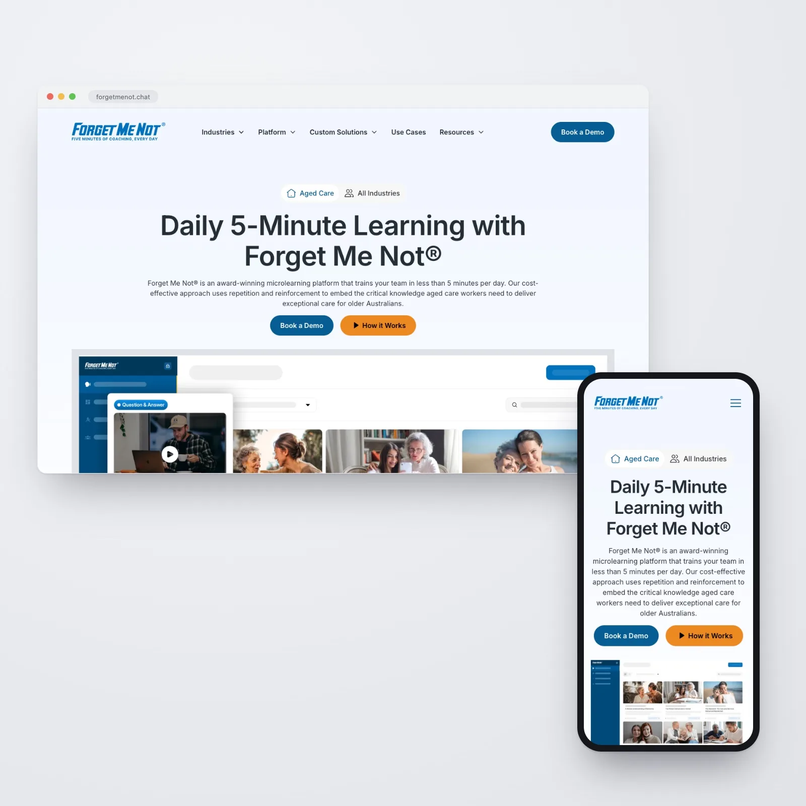
Rebuilding Forget Me Not® to serve aged care and corporate audiences from a single, scalable website
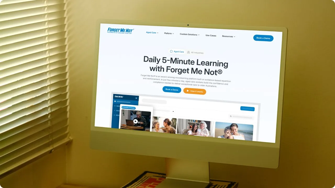
Forget Me Not® needed a website that works like its learning platform: clear on complex ideas and built for two very different audiences. We rebuilt it around a dual-audience architecture, and early signals from organic search and sales conversations are strongly positive.
Overview
The challenge
Forget Me Not®, part of the Obvious Choice family, is a leader in workplace learning across Australia. Rooted in behavioural science and powered by innovative technology, the brand delivers evidence-based microlearning that drives permanent behavioural change, with a footprint spanning the aged care and corporate sectors and a growing audience that expects clarity, credibility, and sophistication from every touchpoint.
The existing website was not keeping up. The structure was outdated and difficult to update or scale, and there was no clear separation between the aged care and corporate offerings, so visitors from either sector had to wade through content that was not relevant to them. Visual inconsistencies across pages undermined trust and usability, and a rigid CMS turned even basic content updates into a bottleneck. There were no tools in place for ongoing marketing or campaign support, and the site was missing opportunities for SEO, analytics, and content-performance tracking.
For a brand built on making complex learning accessible, the website was failing to do the same for its own value proposition. The learning platform was strong; the digital presence needed to match.
Our approach
-
Strategy
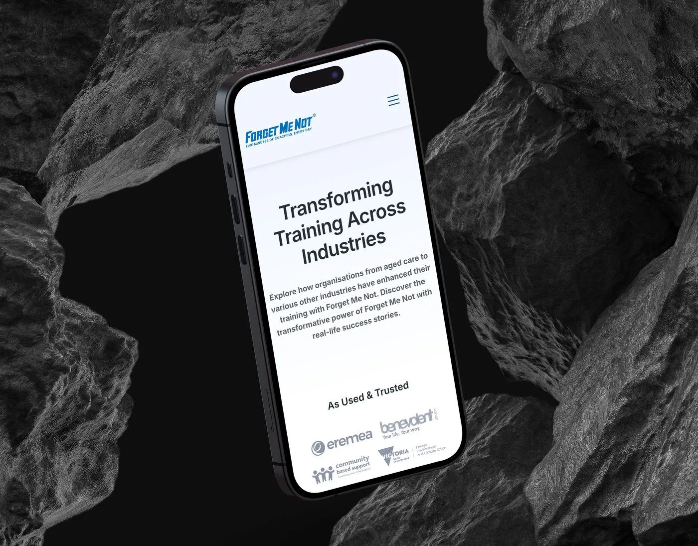
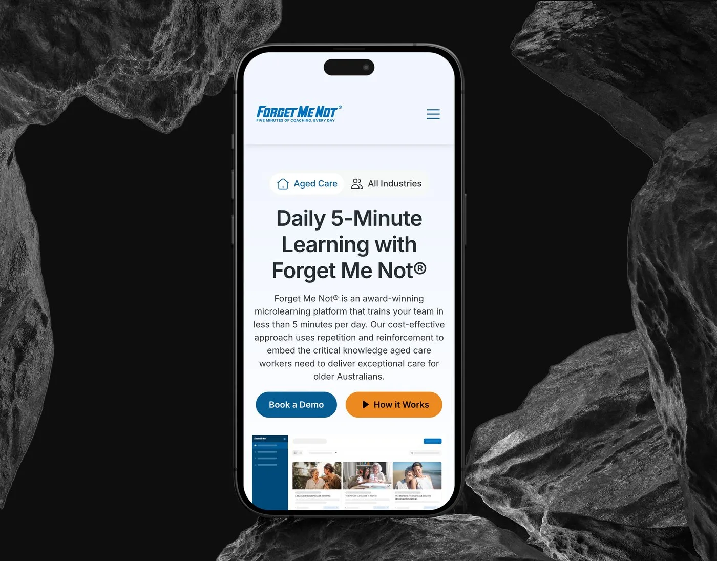
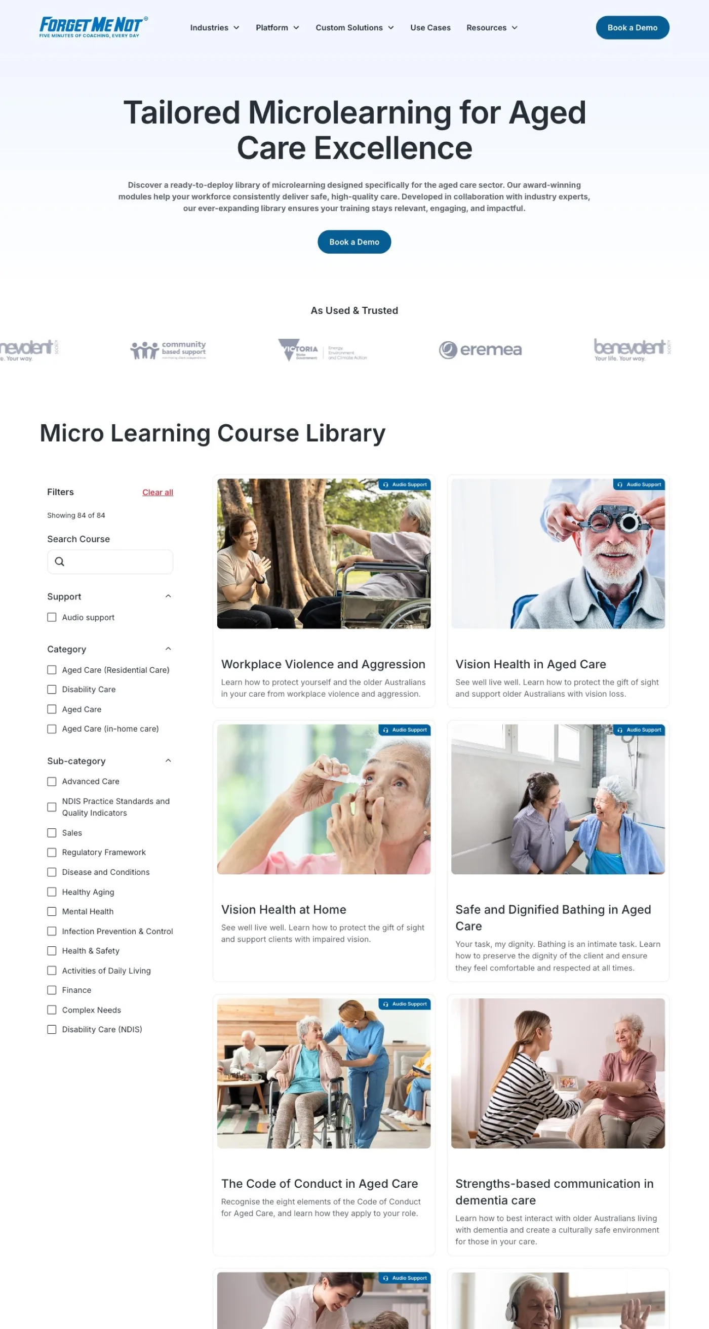
One website serving two distinct audiences, aged care and corporate, without compromising the experience for either.
- A dual-audience architecture with a content-switching modal: visitors self-select their industry on arrival
- From that point the whole experience adapts: service pages, case studies, resources and CTAs all reflect the visitor’s context
-
Design
The design needed to reflect the sophistication of the learning platform itself.
- A consistent design system: custom typography, brand colours and a subtle interaction layer
- Micro-animations, scroll-triggered reveals and transitions that feel premium without slowing the experience
- A visual language unified across 15+ pages, with CTAs placed to capture interest at the right moments
-
Development
Delivered in Webflow using Client-First naming conventions: modular, fast and marketing-ready.
- A dual-navigation system built around the content-switching modal
- A modular CMS for blogs, webinars, case studies, services and product pages, plus an internal component library
- SEO baked in through semantic HTML and structured metadata; GA4, Google Tag Manager and Microsoft Clarity from launch
Technical deep-dive
-
Dual-audience architecture
Two distinct markets, aged care and corporate, served from one site, without duplicating it.
- Visitors self-select their industry on arrival via the content-switching modal
- Service pages, case studies and resources adapt to the selected path
- A focused experience for each sector
-
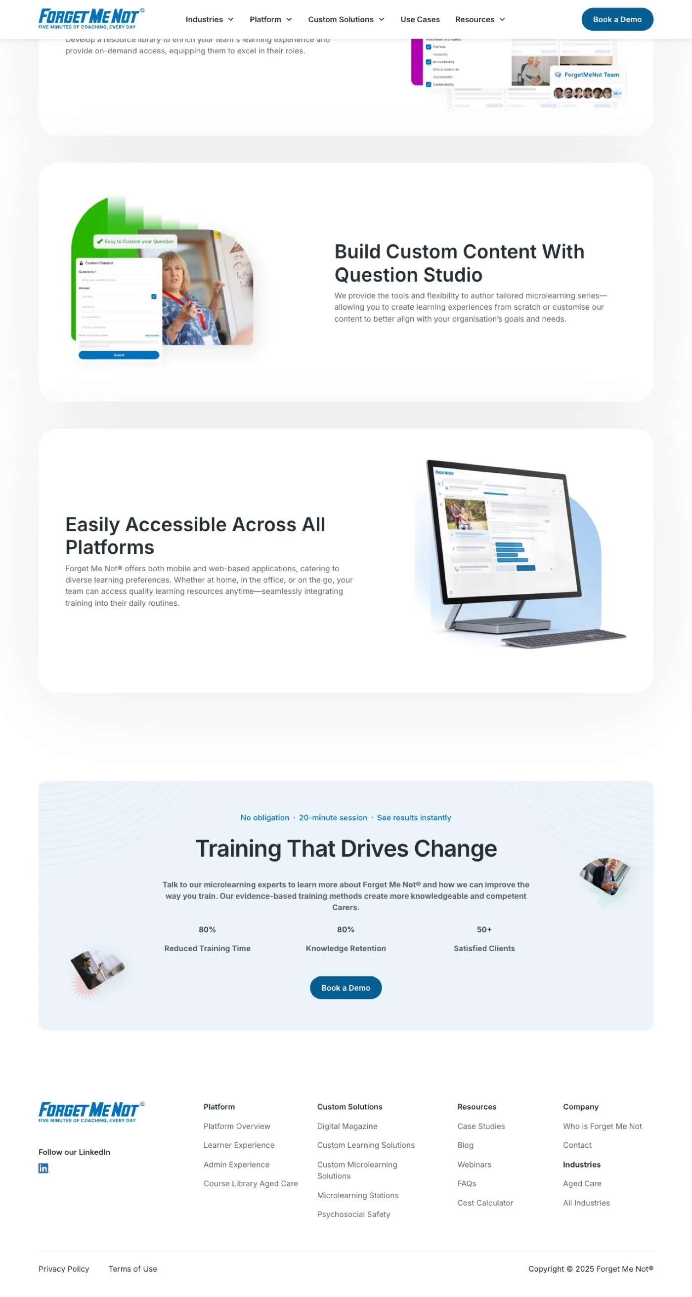
Modular CMS and component library
A modular CMS structure using Client-First naming conventions in Webflow.
- Blogs, webinars, case studies, services and product pages all CMS-driven
- The internal team controls content creation and updates, no developer required
- A component library and design system keep the site consistent as it scales
-
Brand-aligned visual design
A consistent design system reinforces the Forget Me Not® identity on every page.
- Custom typography, brand colours and a subtle animation layer
- Micro-interactions and scroll-triggered reveals that feel premium without slowing the experience
-
SEO and analytics foundation
SEO best practice built into every page.
- Semantic HTML, optimised metadata, a structured content hierarchy and performance tuning
- GA4, Google Tag Manager and Microsoft Clarity integrated from launch
- Full visibility into traffic, behaviour and content performance from day one
Results and impact
The new website launched at a pivotal moment for Forget Me Not®. The behavioural signals are early, but they are very positive.
The post-launch period has shown strong engagement from organic search and a noticeable uplift in how visitors interact with key pages. More importantly, the clearer messaging and improved UX have had a direct impact on sales and demo conversations. When prospects arrive after a demo or a conversation, the site now reinforces the value proposition rather than undermining it. Aged care and corporate visitors follow tailored content paths without navigating irrelevant material, and the component library and Client-First CMS mean the team can add new pages, partnerships, and product expansions without developer support.
Key takeaway
Evidence-based microlearning is a sophisticated product. Communicating its value to two distinct audiences, aged care and corporate, from a single website takes more than good design. It takes architecture that adapts, content systems that scale, and a visual language that builds trust from the first interaction.
Let’s build something that works for your business
High-performing websites, AI-powered software and automations, built to scale and evolve with your business.
30-minute call. We reply within one business day.