Bringing a decade-old retail audio site up to date without losing what worked
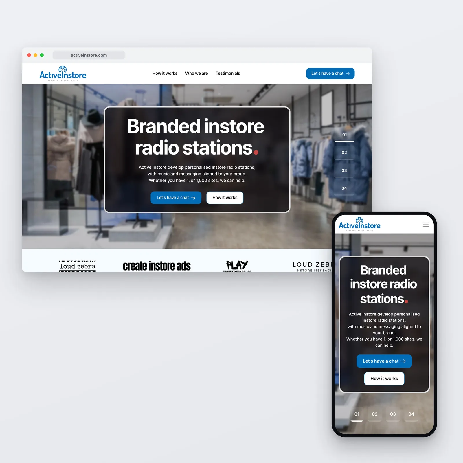
Active Instore supplies branded in-store radio and audio to retail and trade clients across Australia. The business had decades of experience and a website that had barely moved since 2015. The brief was not reinvention. It was to make the site look and behave like the company behind it, and to make enquiring simple.
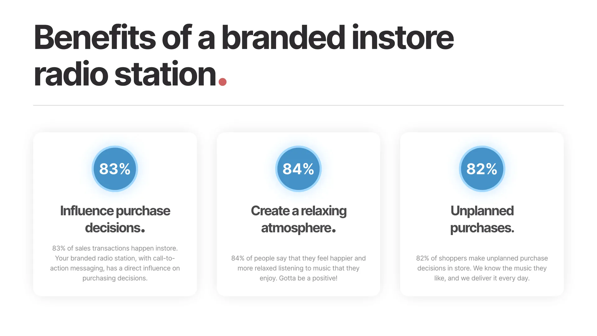
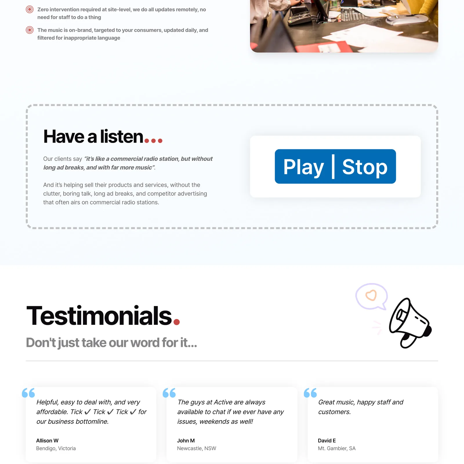
Overview
The challenge
Active Instore designs on-brand music playlists for retail and trade environments, updated daily, so that a shop sounds like itself rather than like a radio station. The company is well established and well regarded.
The website had been largely untouched since 2015, and it was undercutting all of that. The layout and visual treatment read as dated, which quietly costs credibility in a category where the product is taste. Pages ran long and text-heavy, so a visitor could not scan them to work out what was actually on offer. Mobile responsiveness and accessibility had both fallen behind.
There was also no real path through the site. Nothing guided a visitor from arriving to enquiring, and the things that would reassure a cautious buyer, the years of experience and the client results, were not being used.
Our approach
-
Strategy
The brief was explicitly not to overcomplicate the message, so the work started by finding where the existing site lost people.
- A full audit of the legacy site to locate the friction points
- A sitemap that puts the offering within reach rather than behind a scroll
- Trust signals treated as part of the structure, not decoration added at the end
-
Design
Clean and modern, closer to how audio and technology brands present themselves.
- Every key template wireframed around a scroll-friendly structure
- Long-form copy rewritten into short, skimmable sections
- Contrast ratios, font scaling and navigation improved for accessibility
-
Development
Built on a CMS the team can maintain, so the site does not date the way the last one did.
- Mobile-first build, since the previous site handled small screens poorly
- On-page SEO structure and markup built in rather than retrofitted
- Analytics and forms configured, with a handover and training session
Technical deep-dive
-
Copy rewritten to be scanned
The old site explained everything at length. Nobody read it.
- Long pages condensed into short sections with a clear point each
- Tone of voice tightened so the offering lands in the first screen
- Client quotes and experience worked into the flow as evidence
-
Mobile-first rebuild
Poor responsiveness was one of the clearest failures of the legacy site.
- Layouts designed for the small screen first, then widened
- Navigation reworked so it is usable on a phone
-
Accessibility as part of the design
Handled during design rather than as a compliance pass afterwards.
- Contrast ratios raised to a legible standard
- Font scaling and navigation made to work for keyboard and screen reader users
-
A CMS the team runs
The previous site aged because updating it was somebody else's job.
- Scalable CMS structure for internal content updates
- Editor access, a walkthrough and training at handover
Results and impact
The site now reads like the company behind it. The offering is legible in the first screen, the pages can be scanned rather than waded through, and there is an obvious route from landing to enquiry on any device.
The more durable outcome is that it will not date the same way. The last site sat untouched for the better part of a decade because changing it was hard. This one is maintained by the people who know the business.
Key takeaway
An established brand with a dated website is not usually facing a positioning problem. Active Instore knew exactly what it sold and to whom. The site simply was not carrying it, and the fix was clarity and structure rather than reinvention. The part that matters most is the least visible: the team can now keep it current themselves, which is the difference between a site that lasts and one that gets rebuilt again in five years.
Let’s build something that works for your business
High-performing websites, AI-powered software, and automations — built to scale and evolve with your business.
30-minute call · no obligation