Designing an NDIS website that translates human-first disability support into a human-first digital experience
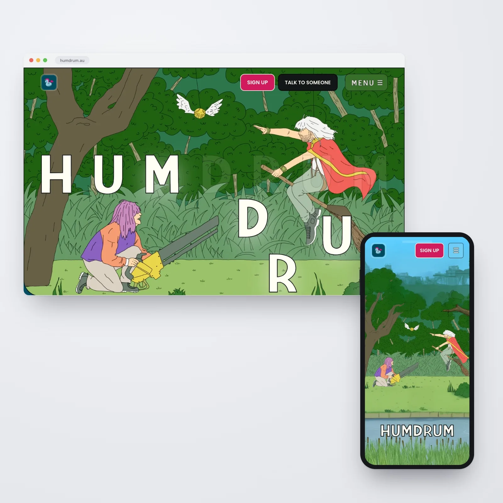
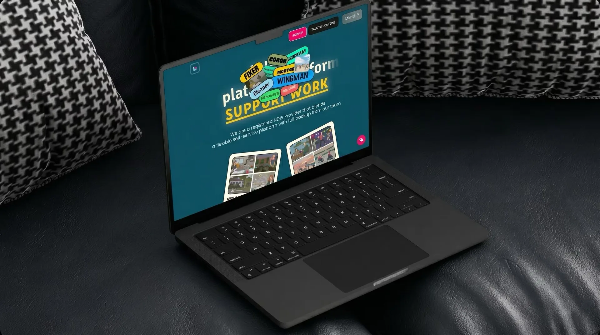
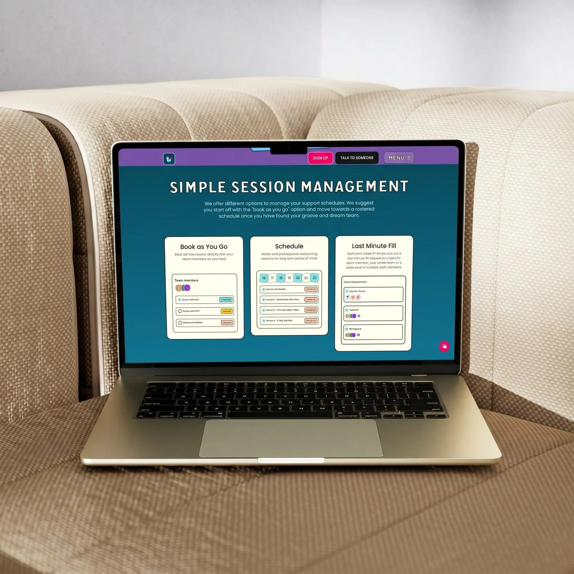
Humdrum is a registered NDIS provider in Western Australia, built around flexibility and independence, and its website needed to match. We redesigned it from the ground up inside the existing brand: four clearly separated user journeys and a fully automated pricing and content system.
Overview
In their words
Richard and the crew from Pinecone Agency were incredibly accommodating in our very particular needs. Every step was met with enthusiasm, awesome communication and passionate creativity. They have continued to check in and nurture our digital presence. Highly recommend.
The challenge
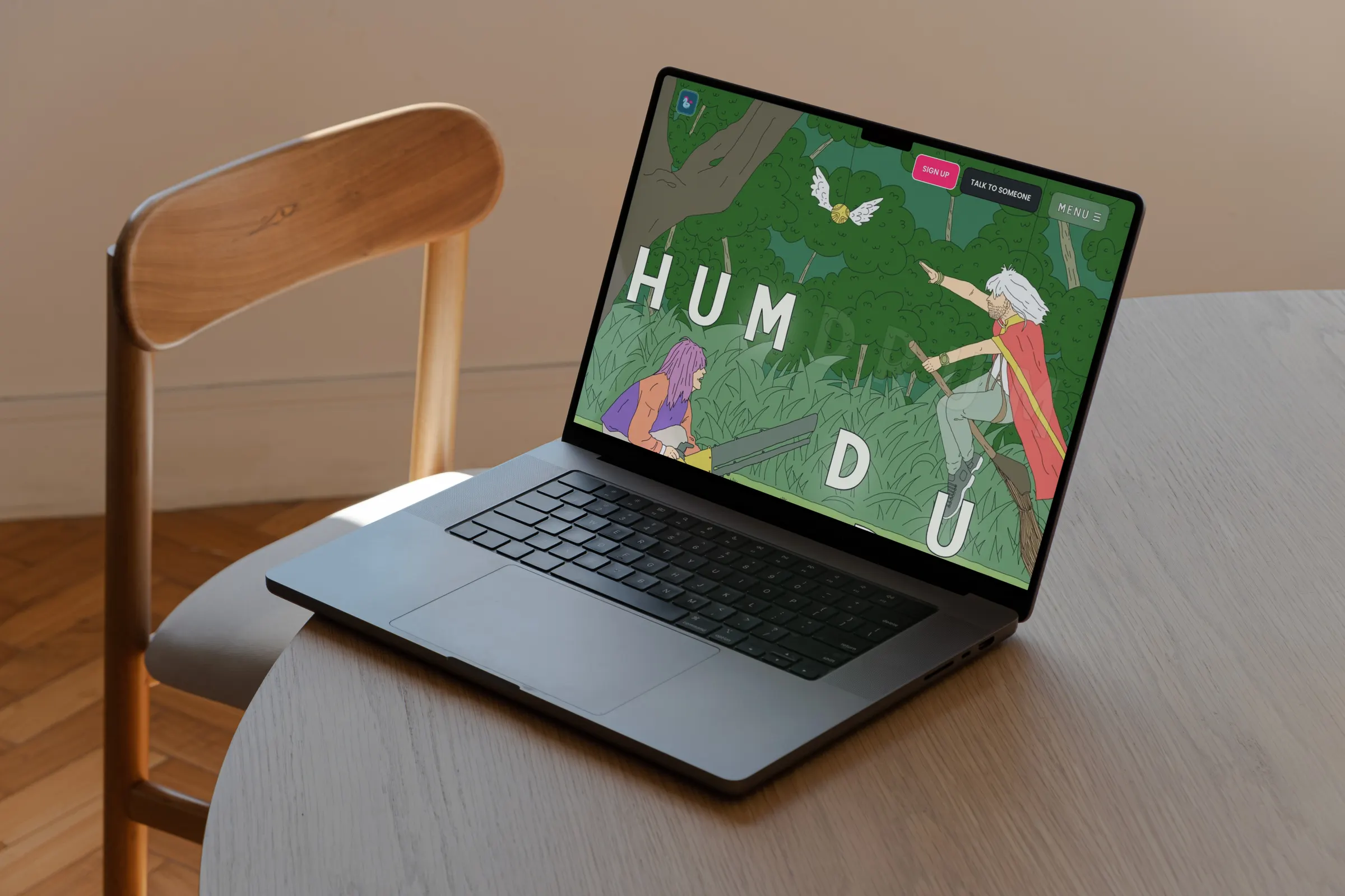
Humdrum’s original website had real personality. It stood out from the sea of beige, corporate NDIS providers. It felt like Humdrum. But everything under the hood needed fixing. The site was slow, not properly responsive, had no SEO foundation, and maintaining it was a drain. As the business grew, manual pricing updates every time NDIS rates changed became unsustainable. The four different audiences (Participants, Support Workers, Therapists, and Co-Residents) all arrived at the same page with no clear path forward.
Humdrum wanted it rebuilt properly without turning it into an endless internal project.
The brief was simple: keep what makes Humdrum Humdrum. Fix everything else.
Our approach
-
Strategy
The strategic challenge was clarity: four different user types served from one platform.
- Participants, Support Workers, Therapists and Co-Residents each have different goals, questions and hesitations
- The content architecture gives each group a clear entry point
- Each journey is designed specifically for that group’s needs
-
Design
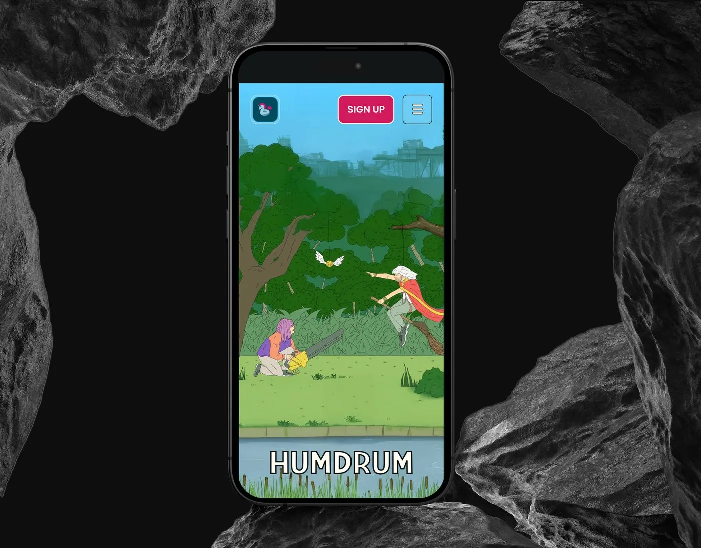
Keep what makes Humdrum Humdrum: warmer and more human than the sea of beige, corporate NDIS providers.
- Their distinctive, irregular aesthetic carried into a web experience that feels true to the brand
- Distinctive without being inaccessible, expressive without being confusing
- Clear visual separation between the four journeys without fragmenting the brand: a site that looks like Humdrum and no one else
-
Development
Built in Webflow with two priorities: automated content management and reliable third-party integration.
- A CMS for services, events, training sessions and blog content, all editable without developer help
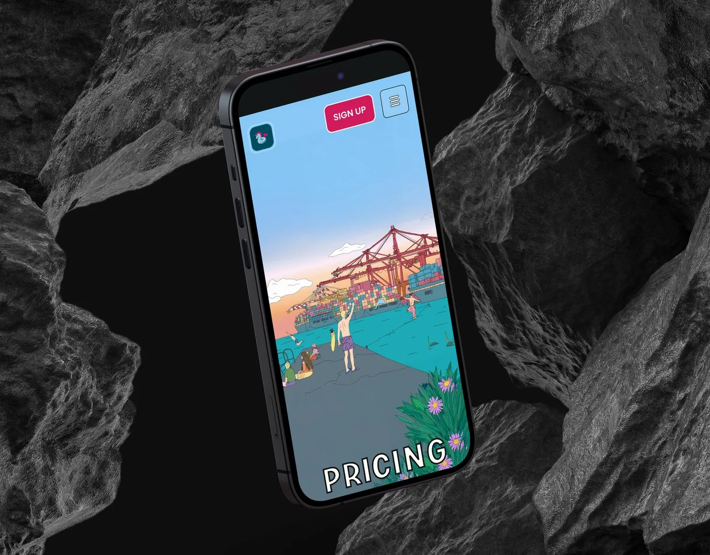
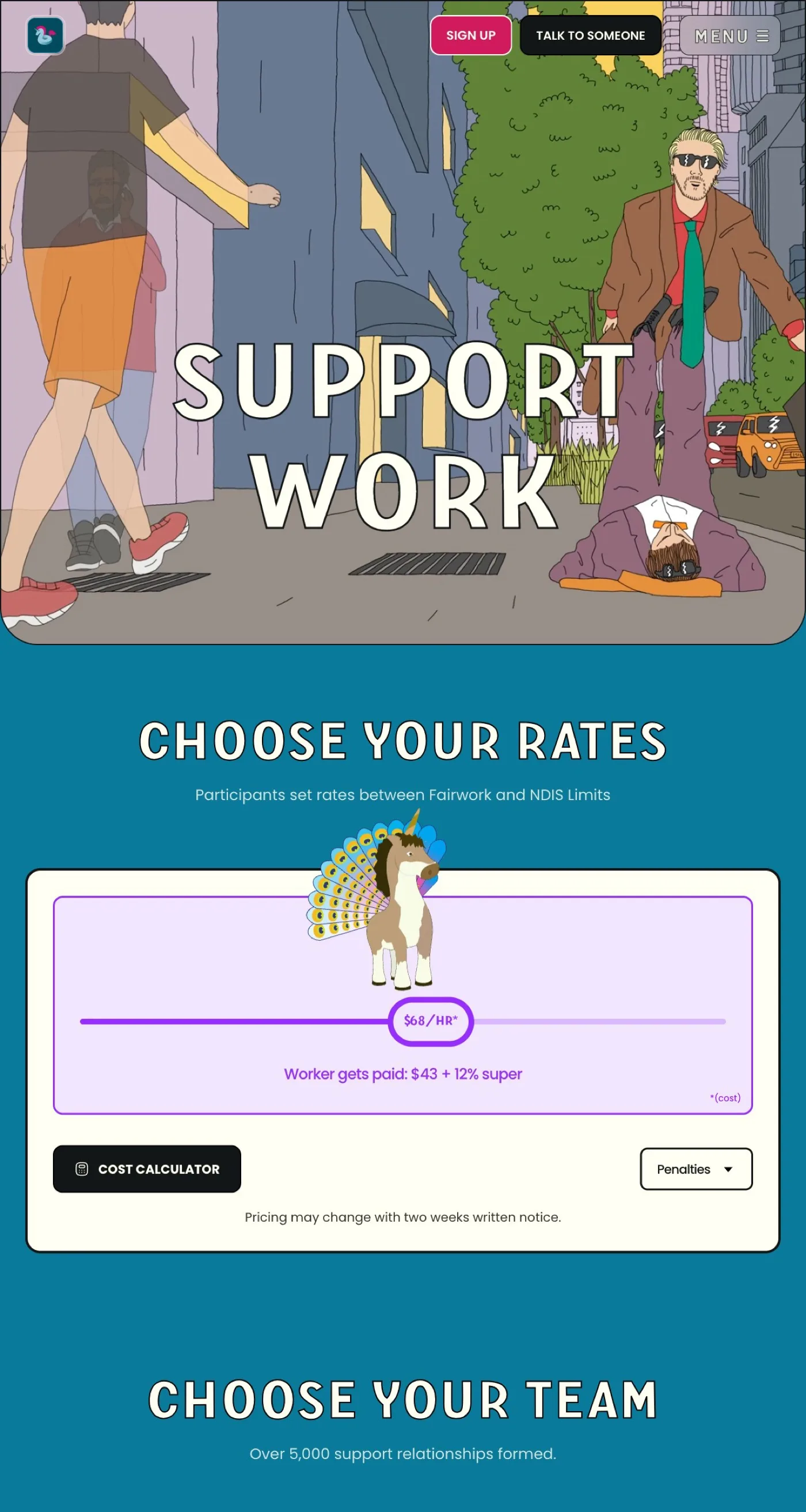
- A dynamic pricing table connected to Bubble via API for live NDIS pricing, with a manual fallback
- Schema markup, semantic HTML and responsive design across every device size
Technical deep-dive
-
Automated pricing via Bubble API
NDIS rates change weekly, before the rebuild, every change meant a manual pricing update.
- A dynamic pricing table connected directly to Humdrum’s Bubble platform via API
- When rates change, the site updates automatically
- A fallback mechanism ensures pricing is never outdated
-
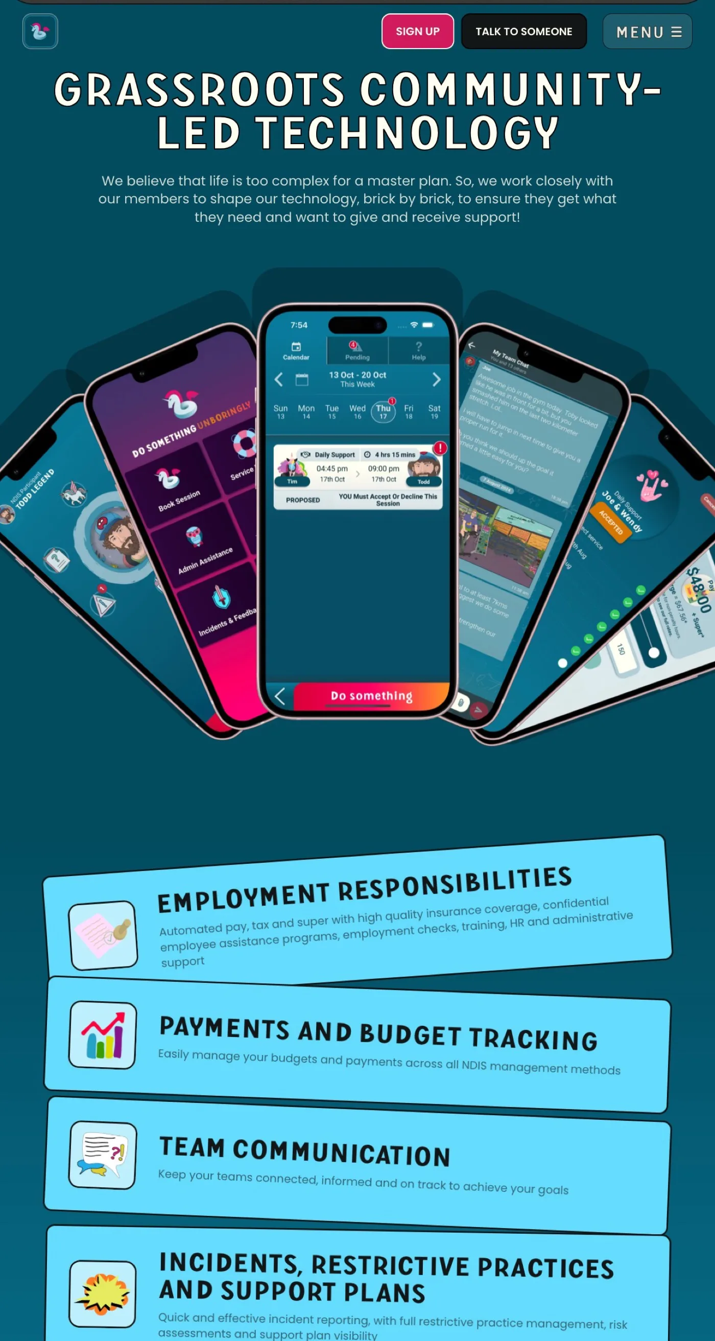
CMS for multiple content types
Four content types, each with structured fields and layout templates.
- Services, events, training sessions and blog posts
- The Humdrum team publishes independently, without developer help
- As new programmes are added, the CMS grows with the platform
-
Multi-audience UX architecture
One website for four audiences, each needing different things from the same platform.
- Participants, Support Workers, Therapists and Co-Residents
- Every navigation decision, page structure and CTA reviewed against one question: does this serve the right person at the right moment?
-
Analytics & behaviour tracking
Google Analytics, Microsoft Clarity and Google Tag Manager, configured from launch.
- Heatmaps and session recordings show how each audience type navigates the site
- Ongoing visibility into what’s working: the platform keeps improving long after handover
Results and impact
The changes were felt quickly, not just in how the site looked, but in how the business related to it.
Same Humdrum: sharper, faster, and built to last. A platform that communicates clearly, works on every device, and runs itself. People get it quicker, the team spends less time on manual updates, and the site finally feels like the business it represents.
Visitors immediately understand what Humdrum offers and whether it’s right for them. Each audience (Participants, Support Workers, Therapists, and Co-Residents) arrives and knows exactly where to go, with less confusion and fewer dead ends.
The rebuilding process also forced clearer decisions about how Humdrum shows up as a business. Clarifying the message for four different audiences carried into every part of how they operate.
Key takeaway
Humdrum built something with personality, warmth, and a clear point of view about how disability support should work. The challenge was not whether the brand had something to say. The challenge was getting the website to say it properly.
Let’s build something that works for your business
High-performing websites, AI-powered software and automations, built to scale and evolve with your business.
30-minute call. We reply within one business day.