Selling eleven residences with a scroll, not a brochure wall
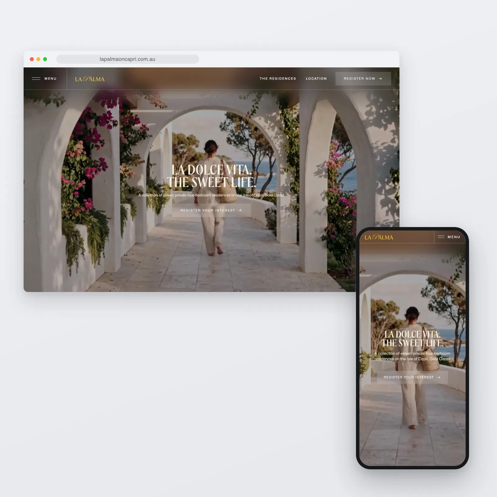
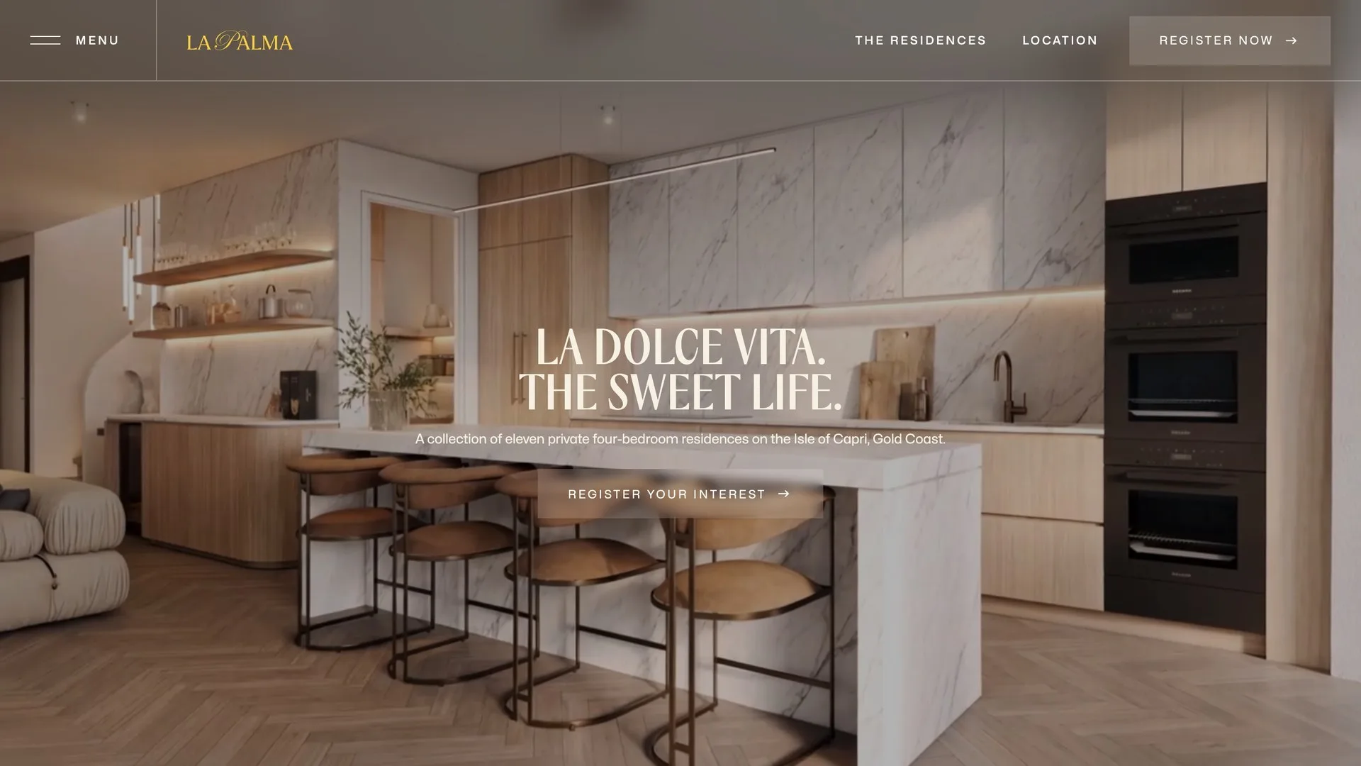
La Palma is a Gallery Group development on the Isle of Capri, Gold Coast: eleven private four-bedroom residences built around courtyards. Buyers at this level are not comparing spec sheets, they are deciding how a place feels. So the website is a single, scroll-led story. Film, light-and-shade photography, and copy that reads like an invitation, with the practical steps, the brochure and the register-your-interest form, arriving only once the feeling has landed.
Overview
The challenge
Eleven residences is a small run. Every enquiry matters, and the buyer for a home like this is not persuaded by a features grid. The site had to do what the sales suite does: slow people down, let the place breathe, and make the next step feel natural rather than transactional.
It also had to serve a campaign. Interest needed to land somewhere the sales team actually works, the brochure needed to be one step away without being a free-for-all, and the whole thing had to hold up on a phone, where most of the paid and social traffic arrives.
Our approach
-
Strategy
One page, one story, told in the order a good sales conversation runs.
- Arrival film first, then the residences, the light, the palettes, the location, and only then the ask
- A single register-interest action, repeated quietly rather than shouted
- The brochure gated behind a simple form, so the campaign learns who is reading it
-
Design
Restraint as the aesthetic: serif type, generous space, and imagery doing the talking.
- Day and dusk imagery paired, because the homes are designed for every hour
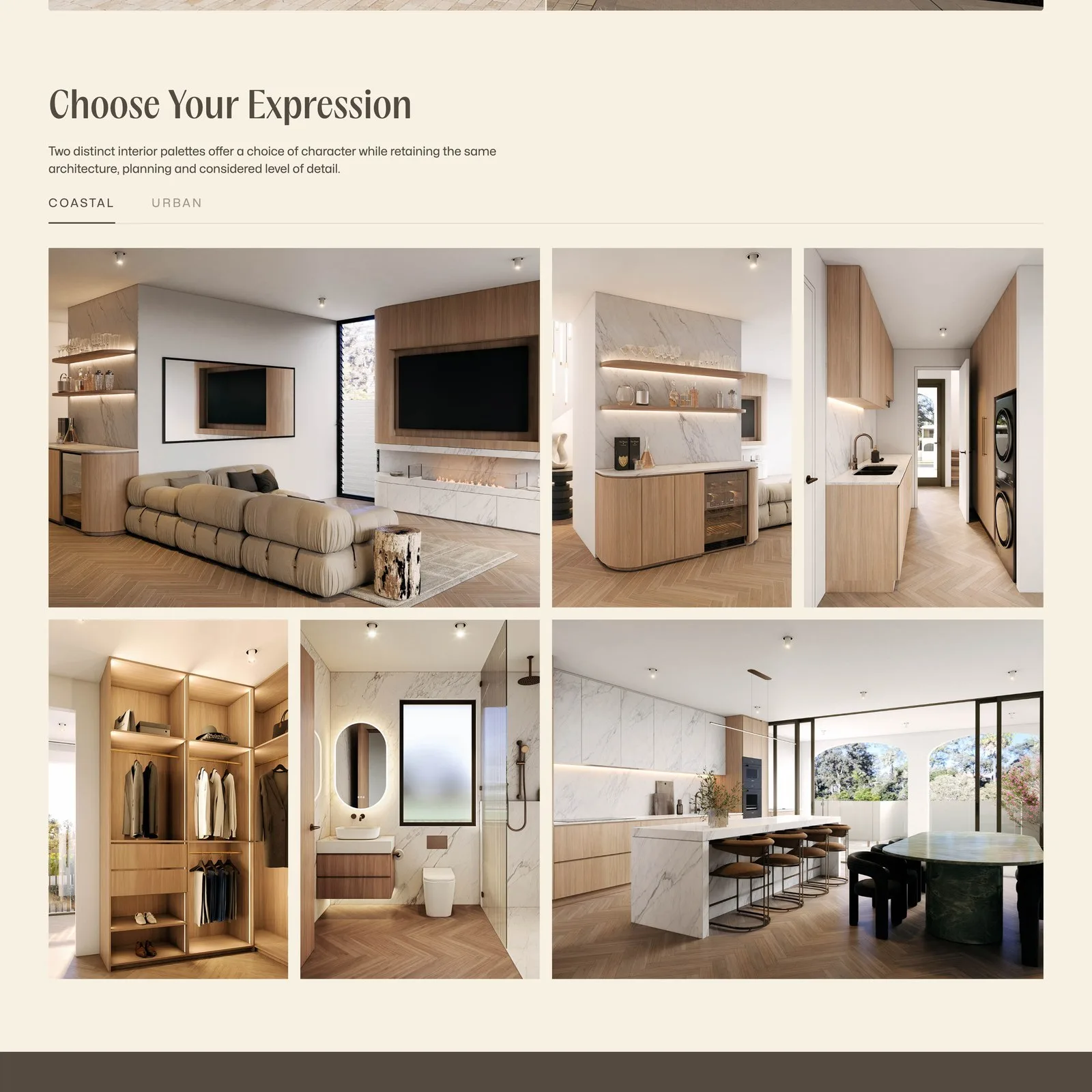
- Two interior palettes, Coastal and Urban, presented as a choice rather than options
- Text that reveals line by line as you scroll, like a page being read to you
-
Development
Built in Webflow with custom motion and the campaign plumbing hidden underneath.
- Custom GSAP text and image reveals with a bespoke easing curve
- An interactive location map with distance rings around the address
- Enquiries posted straight into the developer’s Salesforce as tagged campaign leads
Technical deep-dive
-
Motion tuned to the brand
The animation is the tone of voice. It needed to feel unhurried without ever feeling slow.
- Masked line-by-line text reveals, driven by a custom easing curve
- Staggered image reveals that let renders arrive like scenes, not thumbnails
- Motion held back on load until fonts and media are ready, so nothing stutters
-
A campaign funnel in evening wear
Under the softness, the site is a lead machine wired to the sales operation.
- Register-interest submissions land in Salesforce, tagged to the La Palma campaign
- The brochure download is spam-protected and exchanged for contact details
- Every path resolves to the same two actions: read the brochure, or register
-
Location told as geography
Isle of Capri is the argument, so the map is a feature, not a footer.
- An interactive map with rings at walking, riding and driving distances
- The surrounding waterways and the strip presented as part of the offer
Results and impact
The site gives the sales campaign what it needed: a place to send people that feels like the product. A visitor arrives on film, scrolls through the residences and palettes at their own pace, and leaves either holding the brochure or registered in the sales team's CRM, without the experience once feeling like a form.
Because it is one page with structured sections, the campaign can evolve, with imagery, palettes and offers updated as the release progresses, without touching the architecture.
Key takeaway
Luxury property is sold on atmosphere, and a website can carry atmosphere if you let it. The discipline is underneath: a single narrative structure, motion tuned to the brand, and every soft moment resolving to a hard campaign action in the CRM. Romance on the surface, plumbing below.
Let’s build something that works for your business
High-performing websites, AI-powered software, and automations — built to scale and evolve with your business.
30-minute call · no obligation