Giving a new MidCoast arborist its brand, its voice and its website
MidCoast Tree Solutions is a new arborist business on the Mid North Coast of New South Wales. The owner came to us in January 2026 with a working name, a list of services and no brand. Pinecone Agency built its brand, from strategy and a gum-leaf logo to a style guide, then the website that carries it. From July to September 2026 the site recorded 219 tracked enquiries, most of them through Google Ads.
Overview
The challenge
MidCoast Tree Solutions began as a brief for a new local company. The owner listed the services: arborist works, tree removal, land clearing, habitat works, stump grinding and tree transplanting, for homes and light commercial properties between Forster-Tuncurry and Tea Gardens. There was a working name. There was no logo, no colour palette and no website.
A new trade business has to look established before it has a track record. Our logo brief named the owner’s vehicles as the business’s biggest marketing asset, and the website and social profiles had to tell the same story as the ute door.
So the job was the whole foundation at once. Positioning and a voice, so the business knew what to say. A logo and palette that had to work on a vehicle and on a phone screen. A style guide to keep them consistent. And a website that carries all of it and asks for the quote.
Our approach
-
Strategy
The strategy sets out what the business stands for, who it serves and where it sits against the operators around it.
- Naming research that compared three candidate names and argued against an acronym with no brand behind it, while the owner chose the final name
- Homeowners from Forster to Tea Gardens named as the primary audience, ahead of commercial and emergency work
-
Design
A gum-leaf mark and a palette taken from the local bush.
- A written logo brief set application tests for the refinement round: a ute door, single-colour vinyl and a small social avatar
- Concept rounds moved toward the blue gum, and the owner chose the gum-leaf direction at the kick-off call in February 2026
- Natural greens and browns with no blues, as agreed at kick-off, refined through research into local forest colours
-
Development
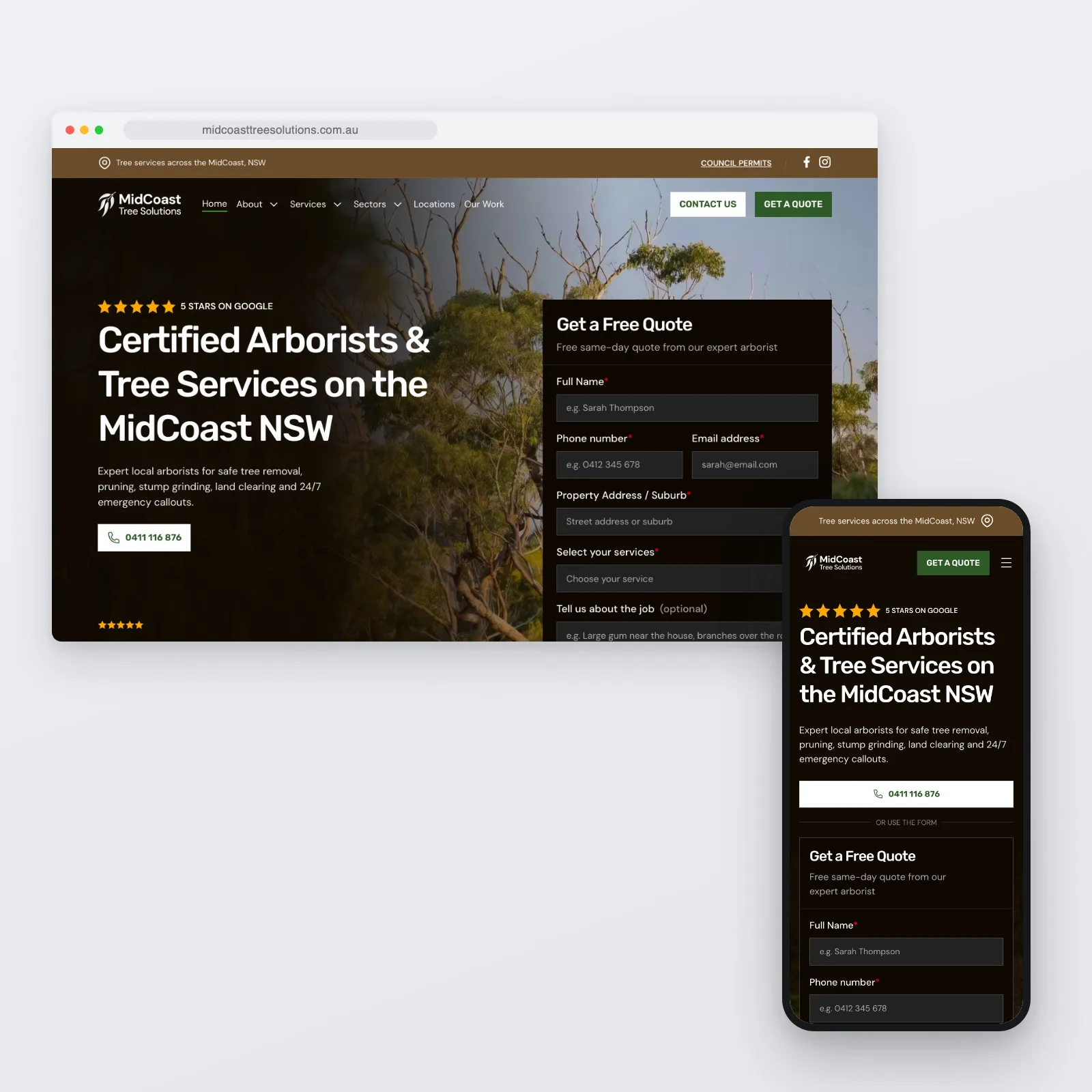
The website is where the whole identity comes together. It is built in Webflow on the style guide’s own colours and type.
- A coming-soon page with the logo, a lead form and the phone number, ready by the end of February 2026
- Service, sector and town pages, a blog and a quote page, with the full site live on 29 April 2026
Brand identity
Pinecone Agency built the MidCoast Tree Solutions brand from a working name: a written strategy, a gum-leaf logo, a three-colour palette, two typefaces and a tone of voice, all in one style guide. The website was then built on that guide.
Brand strategy
Positioning
A premium middle ground between small local operators and the large regional and national contractors.
Core values
- Expertise You Can Trust
- Local Knowledge, Local Care
- Respect for Nature
- Responsive and Reliable
- Fair and Transparent
Personality
- Capable, not corporate
- Local, not folksy
- Knowledgeable, not preachy
- Straightforward, not cold
- Reliable, not boring
Logo
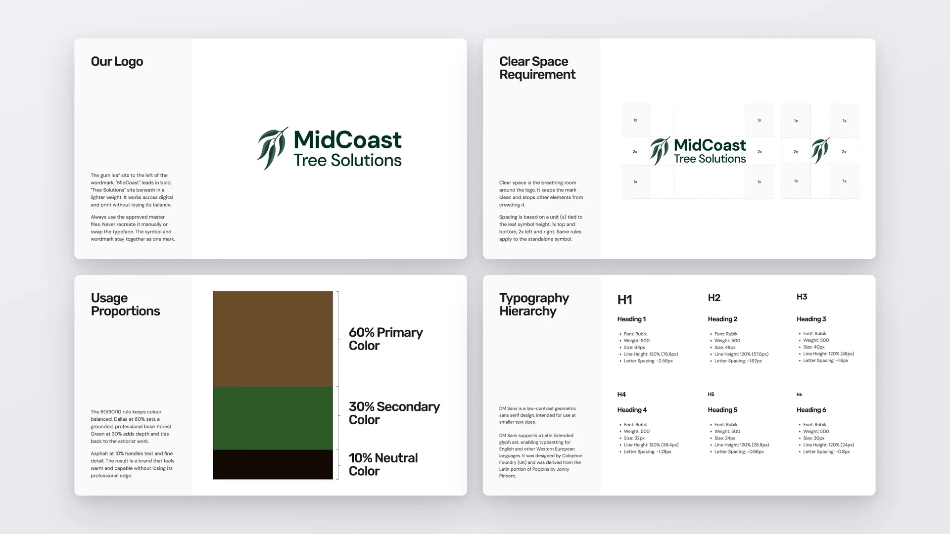
A two-tone gum-leaf symbol, a sprig of four leaves, sits beside the wordmark, with “MidCoast” in bold and “Tree Solutions” in a lighter weight. The symbol also works on its own, as the favicon and the social avatar.
-
Full logo on white -
Full logo on Asphalt -

Symbol on white -

Symbol on Asphalt
- Clear space set by the height of the leaf: 1x above and below, 2x either side, for the full logo and the symbol alike
- Supplied in green, white and black, as PDF and PNG
- Rules for incorrect use: no stretching, no angling, no other typeface and no ground that swallows the mark
Colour palette
Three colours, used in a set balance of 60/30/10. Dallas is a warm brown for reliability and strength, Forest Green stands for the native vegetation, and Asphalt handles text and fine detail. The logo keeps its own deeper green from the master files, outside that balance.
Typography
- Rubik
- Headings, at weight 500 from 64px down to 20px
- DM Sans
- Body text, and the wordmark in the logo
Tone of voice
Direct and clear, in plain language. Warm, not chatty. The guide also carries messaging for each audience, with homeowners first.
Words to use
- Professional
- Experienced
- Qualified
- Safe
- Careful
- Insured
- Local
- MidCoast
- Regional
- Clear
- Honest
- Reliable
Words to avoid
- Best
- #1
- Guaranteed
- Leverage
- Utilise
- Cheap
- Discount
- Always
- Never
In use
The social kit sat outside the written scope. We made it anyway, so the owner had matching profile pictures and covers before the site went live.
-
Profile pictures, with and without the wordmark
Technical deep-dive
-
Service, sector and town pages
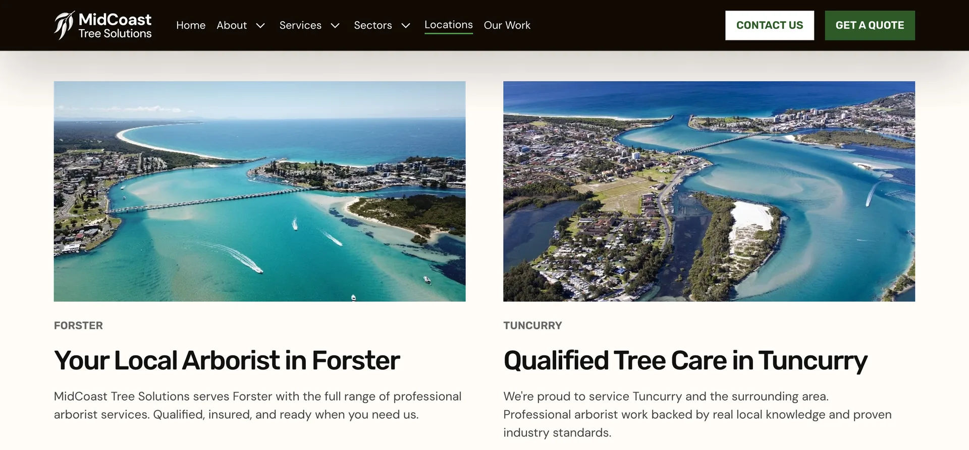
Services, sectors and towns each have their own pages on a shared design, and the parts that repeat come from the CMS.
- Eight service pages, from tree pruning and removal to fire hazard management and emergency work
- Service pages moved from a CMS template to pages of their own in May 2026, on the same addresses
- Four sector pages: residential, commercial, government and 24/7 emergency
- Town pages built one by one, each fed the services offered there from a CMS collection
- A blog index and post template, part of the original build
-
Built around the quote
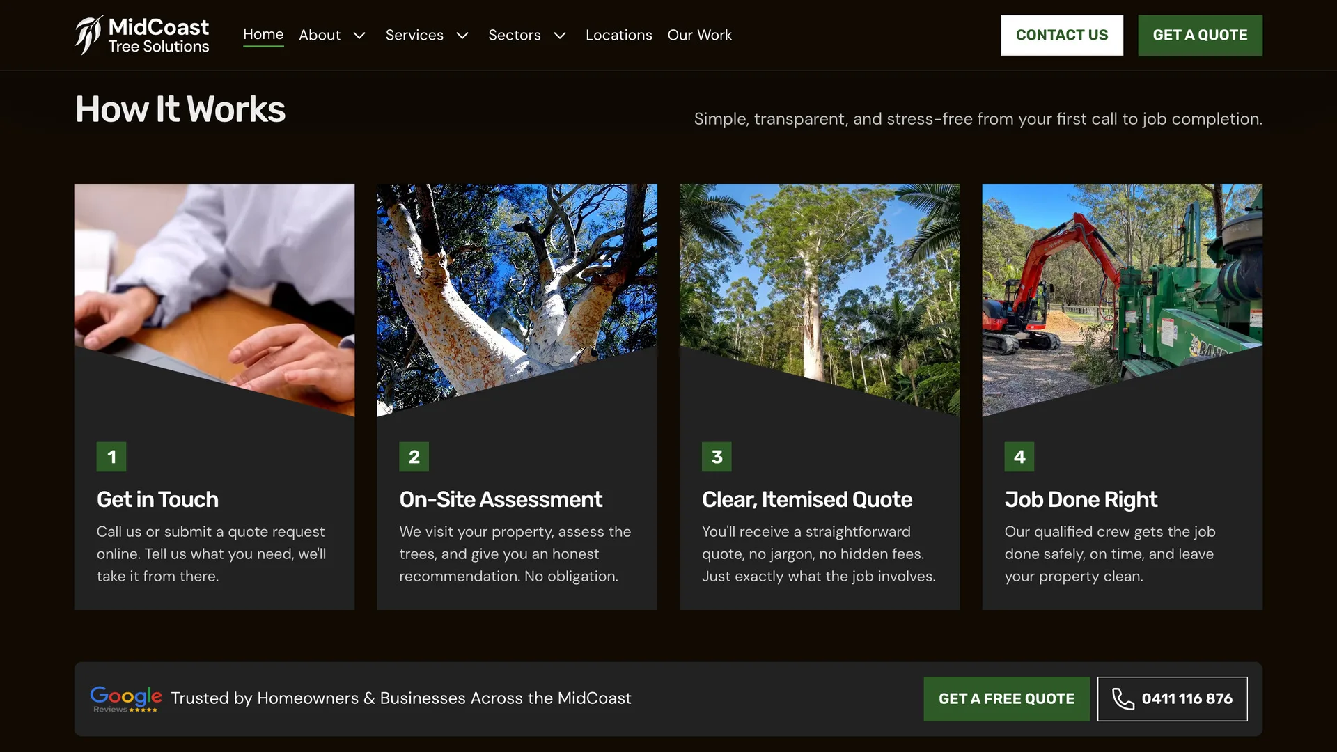
The kick-off agreed two primary actions: a quote form and a phone number. The site keeps them side by side.
- A short quote form: name, phone, email, suburb, the service needed and optional job notes
- The form on the homepage, the quote page and the town pages, next to a click-to-call number
Search and Google Ads
The MidCoast Tree Solutions website went live on 29 April 2026. From May, Pinecone Agency ran its SEO as a monthly service, and from June it ran Google Ads as well.
-
Town pages with local content
Each town page carries a section on the local area, the services offered in that town and how a job works there.
- Town pages grew from 13 to 21 between June and September 2026
- Links into them from the footer and the service pages, with link text such as “Tree Services in Forster”
-
A live forecast on every town page
Every town page carries a 7-day forecast for that town, refreshed on a schedule from the Google Weather API.
- Its own copy for each town and each of 40 weather conditions
- The tree services that suit the conditions, each linked to its service page
-
Articles on local questions
The blog answers the questions homeowners ask before they book, from stump grinding and tree roots to boundary trees.
- 14 articles in the live sitemap in September 2026, 5 of them written before launch
-
Directory listings
The business was listed across local directories in three rounds through BrightLocal, from April to June 2026.
- Apple Business Connect and Bing Places, set up in the June round
- Name and contact details corrected on older listings that had them wrong
-
Structured data and tracking
The homepage, town, service and article templates carry structured data, and the site tracks the two actions it is built around.
- LocalBusiness on the homepage, with the service area and no street address, because the crew travels to the job
- By template: LocalBusiness with map coordinates on town pages, Service on service pages and BlogPosting on articles
- An llms.txt file listing the pages worth citing, updated as new towns went up
- Google Tag Manager in place before launch, with quote form submissions and taps on the phone number tracked as GA4 key events from July 2026
-
Google Ads, measured to the lead
Google Ads started in June 2026, in an account linked to the Pinecone Agency manager account and to GA4. It runs three campaigns: Performance Max, and one search campaign each for land clearing and for tree services. From July, GA4 tracks the two things the site asks for: quote form submissions and taps on the phone number.
Results and impact
The figure comes from the business’s own Google Analytics 4 account, checked on 28 September 2026.
- 219
Tracked enquiries
- 65 quote form submissions
- 154 taps on the phone number
- GA4 key events, 1 July to 27 September 2026
Most of these enquiries came through Google Ads rather than organic search.
Key takeaway
A new trade business does not need a brand and a website as two separate projects. It needs one foundation, built in order: what the business stands for, how it sounds, how it looks, and then the site that carries all three. Building them together meant the website started from the style guide’s colours and type rather than a guess at them.
Let’s build something that works for your business
High-performing websites, AI-powered software, and automations — built to scale and evolve with your business.
30-minute call · no obligation